Patterns of Exclusion
Interactive Artist Book using Laser Printed Acetate and Light Box. Viewers can arrange ads to reveal overlapping patterns within.
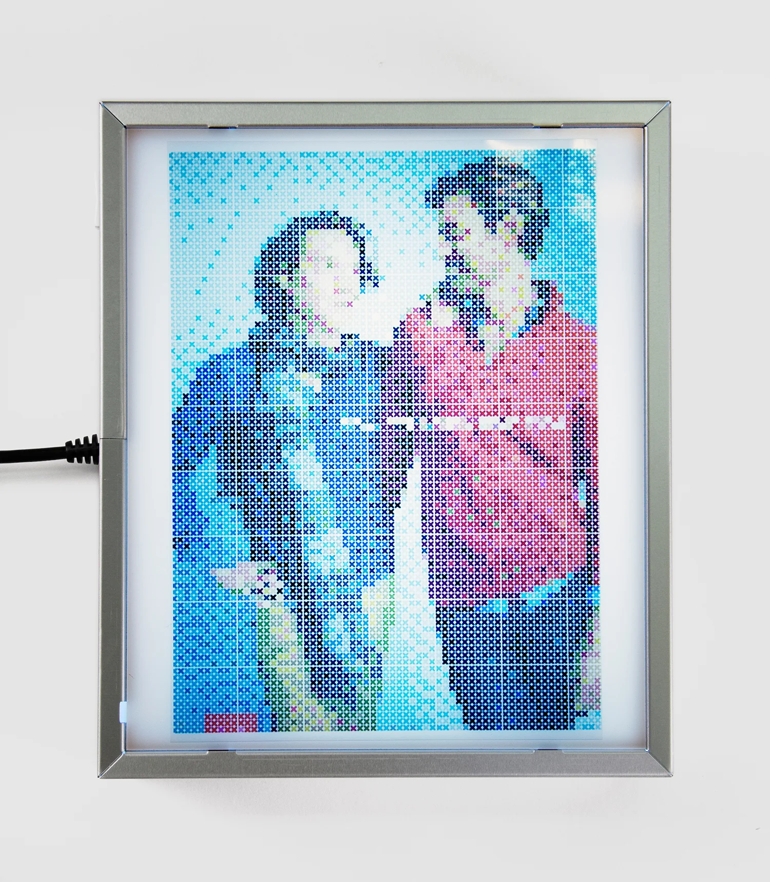
Each piece in Patterns of Exclusion is based on a print ad is taken from media between 2012-15 featuring same sex cis male couples and families. Within theses ads, specific language is repeated to enforce the manipulative intentions of the marketer. The terms “diversity”, “family”, and “acceptance” are echoed throughout each ad to pacify the reader. The ads are taken and re-contextualized within a cross-stitch pattern generator. The generator renders the ads illegible as they are made up only of tiny units being forced onto an invisible grid. These units become more decorative than meaningful, just like the empty rhetoric used within the print ads.
Acetate sheets were used as a substrate for each cross-stitch template print. The acetate sheets mirror the transparent and swallow representation of the queer identities being depicted in each ad reiterating the trite language being used in the ads and type casted characters presented. Each identity is essentially a copy of the heternormative and gender conforming standards they emulate. The regularity of the grid forces the whole image to be divided evenly and to be systematically controlled, much like the gender binary system. Incorporated in both the series, the grid functions to categorize each image into containable units and refer to the warp and weft structures in handicraft media.
Cross- stitch patterns are based on a grid because cloth consists of a warp and weft, making a grid formation to which each stitch will attach. The same cis white gay couples portrayed with their families are now seen deconstructed through the grid and categorized in tiny boxes. The patterns of casting within the imagery are articulated through the cross-stitch template and visible when exposed on the light box. The light box reveals the formulaic (mis) representations of queer identities within each image. Generic figures appear in each template, over and over, highlighting this pattern of exclusion. The grid flattens each image leaving a generic outline of each figure, making individual features non-existent.
Within “Patterns of Exclusion (Gap)”, the absence of individual signifiers leaves the couple as the heternormative pairing they imitate. The “dominant/ male” figure appears positioned higher and gazing downward onto the “submissive/female” figure. The text that was once readable in the original ad becomes a rectangle of smaller squares pressed onto the figures making the image more of a decorative motif than a celebration of diversity the ads seek to carry.
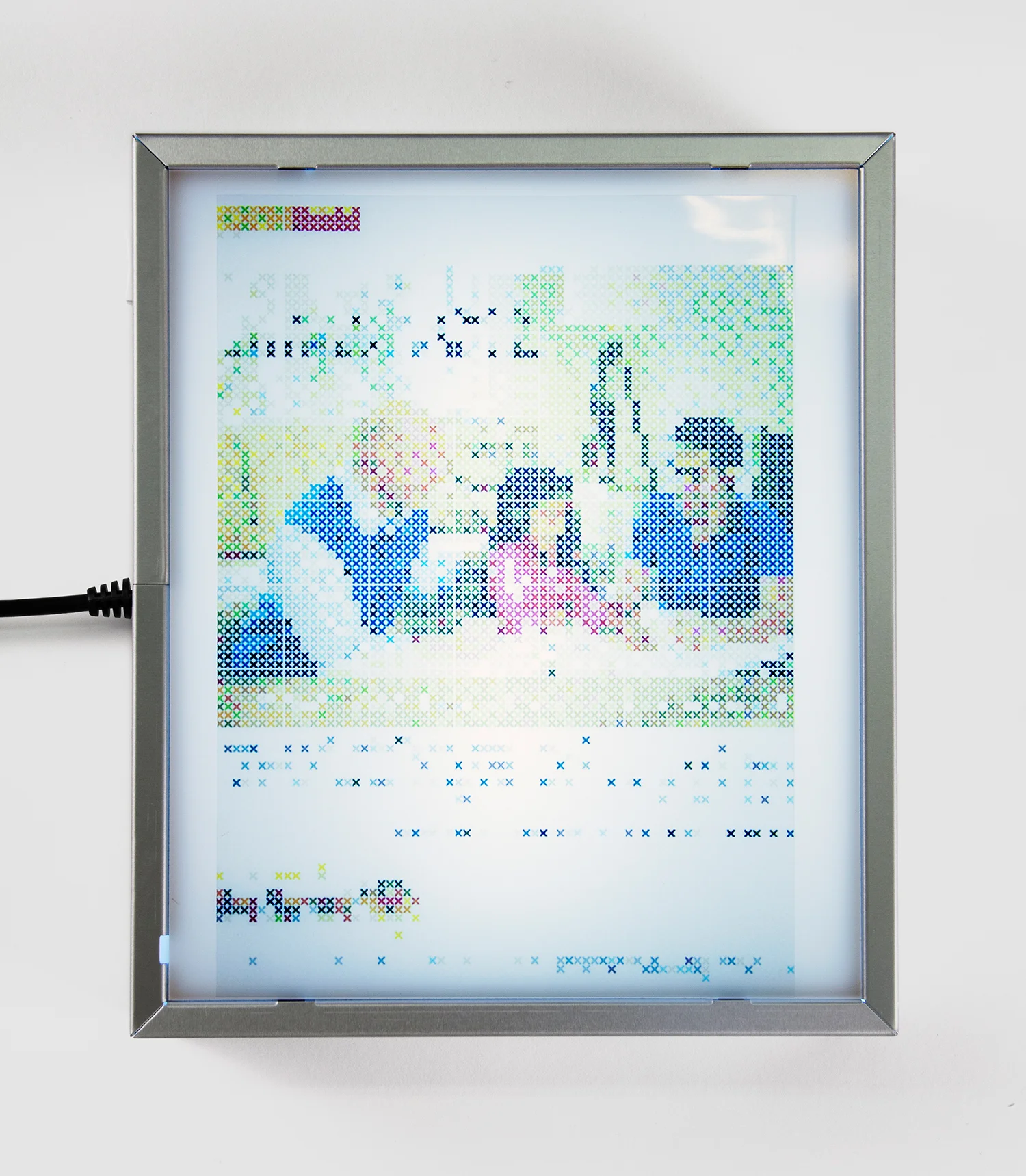
Text within each ad pattern breaks down leaving a grouping of color blocks that erase the context of each ad. This deconstruction leaves only the repetitive presence of the ideal queer couple. In “Patterns of Exclusion (Amtrak)” the text acts as a decorative element to the composition. This piece resembles the layout of a traditional cross-stich sampler (compare with fig. 2.8) because of its large pictorial element as the focal point and bands of motifs and lettering beneath it, which furthers the handicraft reference apparent in the exhibition. The division of the image into the grid not only leaves the text of the image hard to decipher but again eliminate individual characteristics of each cast member.
In “Patterns of Exclusion (New York Financial)” (see fig. 3.2) the figures are distorted and amassed into large color blocks, with the exception of the eyes, which are as single X’s. This treatment of the eyes makes the figures “dummy-like” as if they are standing in for a normative archetype. Again, a reference to the sampler remains within this piece, especially with the four blue color blocks at the bottom of the image acting as a spot sampler section. Some samplers are known as spot samplers because they are made up of blocks of different techniques, while other are called banded samplers because the techniques are produced in a band or line instead of a block section.
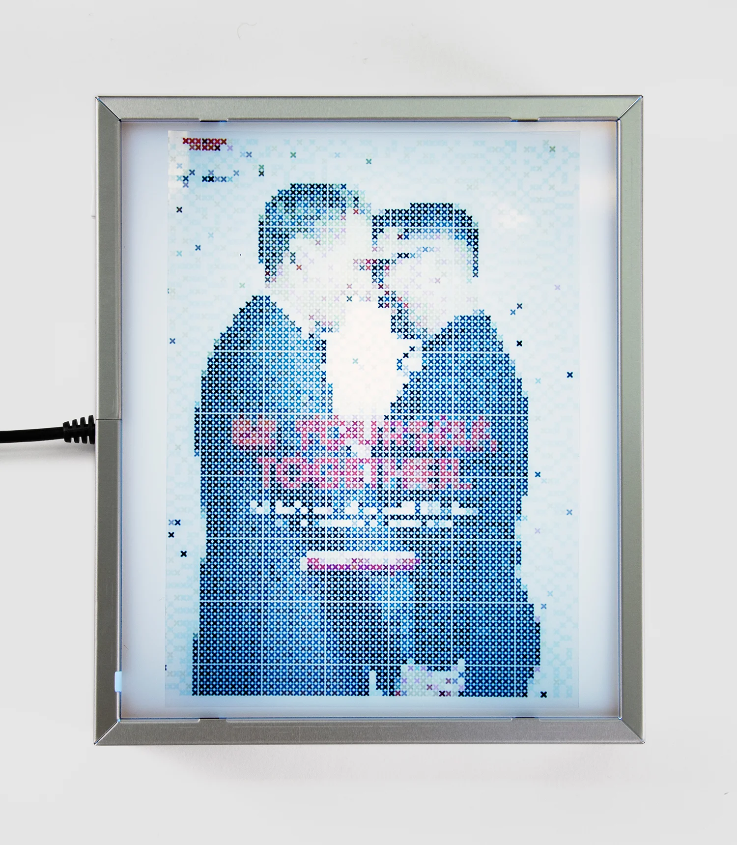
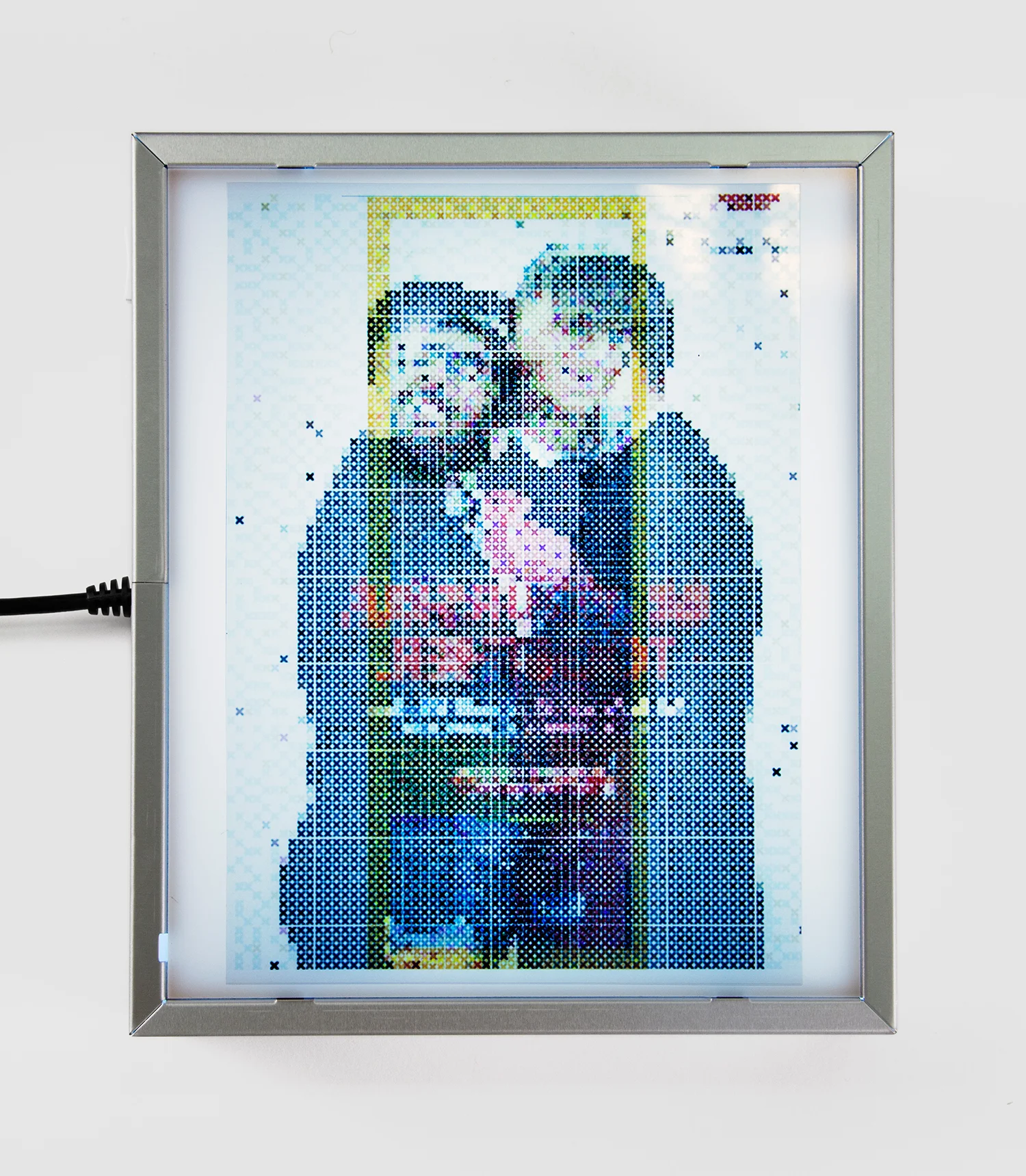
The hierarchical positioning of the figures is also present to denote their designated gender roles. “Patterns of Exclusion (New York Financial 2)” features two figures in the repeated hierarchical arrangement surrounded by a yellow border. The border crops the figures showcasing the dominant figure’s hands holding the other figure’s body. What could be read as a happy couple converts into something more discomforting as the facial features of the figures (particularly the teeth of the figure on the right) emerge as darkened masses. “Patterns of Exclusion (Target)” is the only piece in the series in which the lettering of the original print ad isn’t completely obscured after being arranged into a cross-stitch template.
The phrase reads, “Be Yourself Together” implying an accepting sentiment toward the same sex male couple getting married within the image. However, the acceptance is only a marketing ploy to consolidate the individuals in a unit. This piece reiterates the ideal queer consumer image that excludes the myriad of queer identities that aren’t white cisgendered men. Interaction with the viewer is important to the series because it displays their role as an active participant with the imagery being exposed. The viewer participates in handling and exposing the image on the light box physically, but on a deeper level, they layer patterns to reveal the formulaic type casting of each coupling.
All photos by Drew Nikonowics